Very Peri, the 2022 Pantone Color of the Year, was still ruling the world as of yesterday.
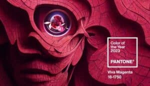
With the announcement of Viva Magenta as the Color of the Year 2023 by the Pantone Color Institute, a brand-new era has begun.
Learn everything there is to know about Viva Magenta in this article, including its characteristics, its inspiration and significance, the colors that go best with it, the Magentaverse, and practical applications for businesses
What is Viva Magenta?
The Pantone Color Institute describes Viva Magenta 18-1750 as “a vivid color that vibrates with vim and vitality” and “an uncommon red for an unorthodox time.”
The hue was initially included in the Pantone color palette in 2019 and has since grown in popularity.
The Pantone Color Institute designated it as the official Color of the Year 2023 on December 1, 2022; it is a hue that captures the global mood and the state of the planet today.
Pink was speculated to be the color of the year for 2023, but Viva Magenta isn’t the Barbie pink that some people thought it would be, nor is it the millennial, Valentino, or baby pink. It introduces the globe to what Pantone classifies as “The Magentaverse,” a homage to Mark Zuckerberg’s Metaverse and a color that transcends digital and physical surroundings. The company describes it as “an unorthodox red for an unconventional time.”
The 2023 Color of the Year was announced by Pantone in the following way: “Tapping into the experimental spirit of Viva Magenta, Pantone investigates the interplay between Artificial Intelligence and human creativity to create “The Magentaverse” available to the public for the first time.”
“PANTONE 18-1750 Viva Magenta paints a new tale,” they continue. A pulsing color whose enthusiasm fosters hope and excitement, bold and courageous. It is a strong, empowering red that invites experimentation and uninhibited self-expression. It is an energizing, boundary-less color that is obviously “out there” and makes a bold statement. PANTONE 18-1750 Viva Magenta welcomes each and everyone with the same rebellious spirit. It is audacious, funny, and welcoming of all.
PANTONE 18-1750 Viva Magenta is a subtle blood red tone that strikes a balance between warm and cool. It is also a hybrid hue, one that easily bridges the real and the virtual, evoking our multidimensional world. It is a carmine red that is assertive without being aggressive and instead adopts a “fist in a velvet glove” strategy. PANTONE 18-1750 Viva Magenta, a dynamic red tone that exudes vitality, can inspire creativity to forge a more promising future.
It was about time for another red-based Color of the Year, said Leatrice Eiseman, executive director of the Pantone Color Institute. Red is unquestionably making a statement in the world of fashion, with designers like Tom Ford and Roksanda debuting magenta-colored red on the runway.
So what exactly does Viva Magenta mean?
The Color of the Year for this year is strong and empowering. It is a brand-new animated red that exudes unbridled enthusiasm, encourages experimentation and unrestrained self-expression, and manifests as a statement color that stands out from the crowd.
Anyone and everyone with the same zest for life and rebellious spirit is welcome to use PANTONE 18-1750 Viva Magenta. It is a color that is bold, witty, and welcoming to all.
The Magentaverse color scheme includes Viva Magenta and other hues.
Not only does the Pantone Color Institute announce the Color of the Year. Additionally, it has complementary hues in its color scheme.
This year is no different.
Along with Viva Magenta, Pantone also unveiled The Magentaverse, an 8-color palette. It claims that the following hues work best with Viva Magenta:
- Pale Dogwood, PANTONE 13-1404
- Gray Sand, PANTONE 13-1010
- Gray Lilac, PANTONE 13-3804
- Pale Khaki, PANTONE 15-1216
- Fields of Rye, PANTONE 15-1115
- Agate Gray, PANTONE 15-6307
- Plein Air, PANTONE 13-4111
The source of Viva Magenta’s inspiration?
Viva Magenta is “rooted in the primeval,” according to Leatrice Eiseman, Executive Director of the Pantone Color Institute. They sought inspiration from nature and what is real in our technological age with this color.
So Viva Magenta mimicked “the red of cochineal, one of the most precious dyes belonging to the family of natural dyes as well as one of the fiercest and brightest the world has known.”
The red cochineal is a 0.2-inch beetle that lives in the Armenian Highlands. It has endured challenges for millennia, fitting in with the environment thanks to its bright red shell, all the while other species were going extinct.
This bug demonstrates how to endure. That thickened exterior is a testament to the guts and fearlessness that many of us have developed over the past two years.
However, it wouldn’t be accurate to state that the Pantone Color Institute’s decision to choose Viva Magenta the COY 2023 is an effort to maintain humans connected to the natural world. It makes no attempt to minimize the world’s technological development.
Contrarily, Pantone welcomes our steady shift to virtual reality with Viva Magenta, as evidenced by this year’s unusual presentation of the zeitgeist color of 2023.
In many respects, the previous few years were revolutionary. As a result, whether in a cybernetic universe, a traditional space, or a mystical fusion of both, there is now a place where we are free to explore and be accepted for exactly who we feel we are. We are constructing a dynamic environment that promotes exploration, one that integrates the virtual with the actual world and empowers our fortitude and spirit to investigate novel possibilities.
Conclusion
The Pantone Color of the Year is a color trend forecast for the consumer, thus it should be incorporated in both client designs and consumer goods. Some innovative brands update their aesthetic each year to reflect the latest hue, but the majority of companies cannot take that much change.
Not necessarily a rebranding, the Color of the Year is intended to be used in marketing and product development. This means that you can use the new hue to make advertisements, but keep your logo and brand colors the same.